It’s almost a given that each new version of Windows will bring some change that makes it visually distinctive from the previous version. In our last piece, we evaluated several factors that need to be considered before hitting the upgrade button. With just a week left before Microsoft launches Windows 10, as it embarks on its quest to reach a billion customers, a lot’s been spoken about Windows 10 already. But like you, many wonder what’s the real deal. So here’s a quick summary after using Windows 10!
With Windows XP, it was the bright blue bubbly UI. Then came along Vista with the glassy semi-transparency of Aero. Windows 7 brought along a new taskbar. With Windows 8 it was ‘Modern UI’ and the start screen. So where does Windows 10 fit in?
What Windows 8 should have been
Using Windows 8 now feels like using an early build of Windows 10 when they has just started putting in a touch interface, but hadn’t integrated it just yet. Windows 10 brings its own visual refresh, new icons, a cleaner taskbar, things just seem to fit in a lot better. No forced full screen start screen that covers everything and demands your attention just so you can click on one icon. A better modern control panel that doesn’t have you constantly switching needing to access the old control panel because things you want to configure are missing.
Simply making it possible to run the new ModernUI apps makes them a lot more useful.
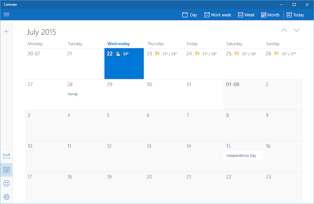
Gone is the charms bar that would suddenly pop out from the left edge of the screen, except if you wanted it to of course; and gone are the convoluted gestures for switching between apps. They aren’t needed any more as the whole separation between Modern apps and classic apps is gone. Those modern apps can now run in a window just like traditional apps, they just look different. The charms bar actions are now integrated in the window titlebar.Desktop applications
You know what, it’s hard to get excited about applications being able to run in a window. Desktop applications running in a window isn’t a fresh concept, especially in an operating system called Windows, that launched with support for running apps in a window nearly 30 years ago. It’s hard to get excited about the removal of a lot of the poorly designed features from Windows 8. It’s also hard to get excited about the return of the start menu, which is only a thing because it was removed in the first place.
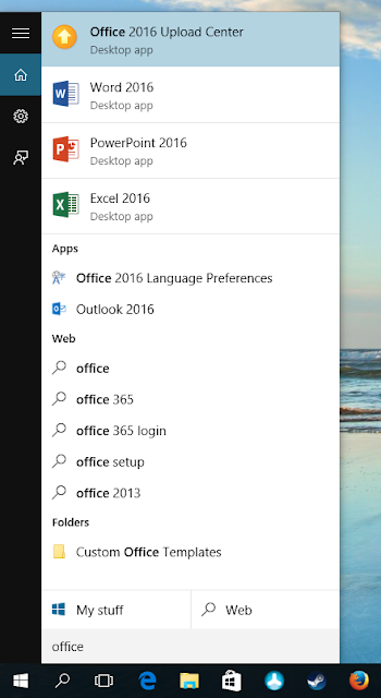
Search is a big enough part of Windows 10 then a search bar on the taskbar is now default.
For those coming from Windows 7, the start menu has just changed, not come back. But is it for the better? We fear not. The best thing that can be said about the new start menu is that it’s there and doesn’t need to take up the whole screen. Browsing it is clunkier than the start menu of Windows 7. Searching though, is a lot better. It’s clear that searching is the favoured way of using the new start menu.
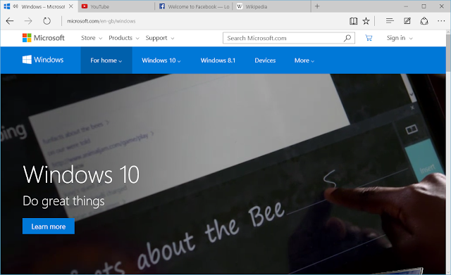
Likewise, a new browser by Microsoft is great! But it isn’t exactly a point in favour of Windows 10. The only reason to count it as a Windows 10 feature is because Microsoft won’t release it for other platforms.
Microsoft’s new Edge browser is actually quite good, and it’s a shame it isn’t available on older versions of Windows.
Still lots to be excited about
We’ve been a bit harsh now, but Windows 10 is a genuinely exciting release, and one that’s only going to get better. There are new features that are truly worth getting excited about, and some of them we will cover in more detail.
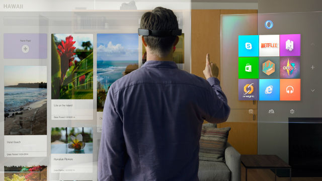
Windows 10 HoloLens experience. Image: Microsoft
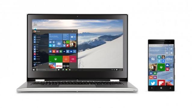
A lot of the exciting changes actually have to do with the Windows ecosystem so aren’t as visible. For the same Windows 10 core is now what will power mobiles, the XBox, and even the upcoming HoloLens holographic displays.
This might not mean much for users now, but it expands the reach of Windows and makes it easier for developers to create applications that run on all versions of Windows whether it is mobile, desktop or XBox. Hopefully the payoff will be more and better applications.
Tangible improvements
Windows 10 has a good few improvements to user experience as well. The first is Cortana, a new digital assistant — like Siri or Google Now — built into Windows 10. We’ll talk more about it once it’s available in India, and it looks to be soon.
The new virtual desktops feature in Windows 10, called Task View has been talked about a lot, but it isn’t the only improvement to window management that you will see in Windows 10.
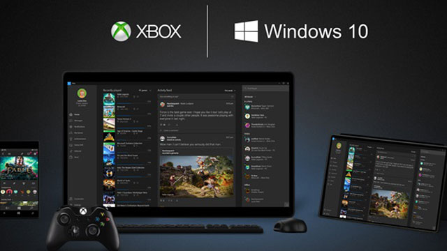
For gaming enthusiasts, there is DirectX 12 and the new XBox gaming app, both of which expand Windows gaming in different ways. DirectX12 improves the performance and fidelity of games built using it, while the XBox app integrates with existing games expanding what’s possible with them.
Finally we have Continuum, an exciting new feature that allows Windows to smoothly adapt the user experience based on a device’s use as a desktop, tablet or phone. This in itself is a major selling point for Windows 10, and relies on some of the more invisible work that’s happened behind it, such as a common core for Windows running on all kinds of devices, and Universal Windows Applications.
